BRAND IDENTITY / WEBSITE DESIGN / LOGO DESIGN
Chemistry
My client founded a women-led marketing firm focused on delivering strategic, audience-driven solutions for healthcare startups. Her mission is to empower innovative healthcare entrepreneurs through thoughtful, creative marketing that connects and converts.
The challenge was to design a website that clearly communicates her depth of expertise in healthcare marketing, while also expressing a sense of empowerment, creativity, and a distinct point of view.
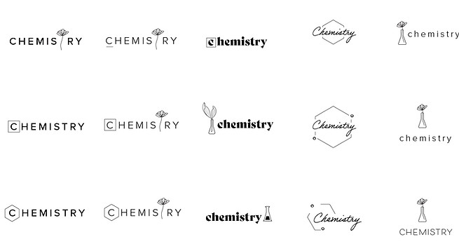
LOGO EXPLORATION
The goal of the logo was to visually express the company’s belief that the right chemistry drives stronger collaboration, better outcomes, and meaningful results. Exploration of connection and synergy, symbolizing how thoughtful partnerships fuel success.
A subtle feminine touch was woven into these concepts, reflecting the company’s identity as a women-owned firm while maintaining a sense of sophistication and credibility within the healthcare space.
FINAL LOGO
The selected logo is a refined wordmark set in an elegant, expressive serif typeface. Its bold, high-contrast forms convey authority and expertise, reflecting the firm’s deep knowledge of healthcare marketing. At the same time, subtle flourishes and thoughtful detailing introduce a feminine sensibility—balancing strength with softness and aligning with the brand’s women-led identity and creative spirit.

MOOD BOARDS
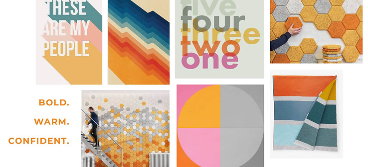
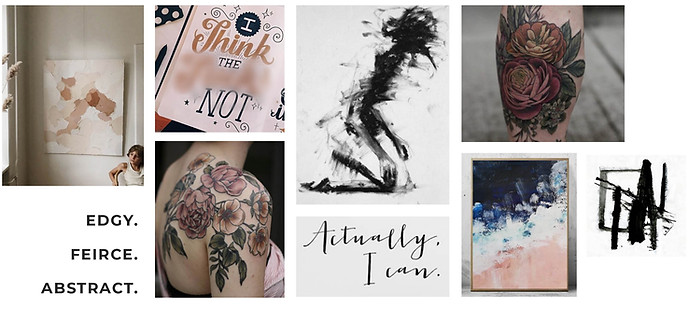
Before designing the website, I developed three distinct mood boards to help define the visual direction of the brand. Each concept offered a unique interpretation of the core values—empowerment, creativity, and expertise—explored through different combinations of color, typography, and imagery.
Presenting multiple directions created a collaborative decision-making process, giving my client space to react, refine, and align on what resonated most. This approach ensured the final design felt intentional, cohesive, and fully aligned with her vision—while speaking directly to her audience of innovative healthcare startups.
CONCEPT 1

CONCEPT 2
CONCEPT 3
THE FINAL PRODUCT
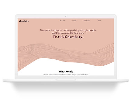
The final website builds on Concept 1, evolving it into a cohesive digital experience rooted in organic lines and fluid shapes. These elements evoke a sense of movement, collaboration, and creativity—core to Chemistry’s approach to solving complex healthcare challenges. The soft, flowing forms reflect the interconnected nature of the brand’s work, reinforcing the idea that effective marketing solutions are shaped through dynamic, collaborative partnerships.
The color palette blends warm, earthy tones with muted pastels, intentionally chosen to convey trust, empathy, and a subtle nod to the brand’s feminine leadership. Together, the organic forms and considered color system create a visually engaging, cohesive experience—one that aligns with Chemistry’s mission to deliver impactful, results-driven solutions in a way that feels both innovative and deeply human.