Bread Box Rebrand
Bread Box is a small-batch, Portland-based bakery focused on delivering thoughtfully crafted, made-to-order bread directly to its community. Rooted in simplicity and quality, the brand emphasizes intentional ingredients, and the everyday ritual of sharing fresh bread. Each loaf is baked to order and delivered the same day, creating a direct, personal connection between maker and customer.
The challenge was to design a digital experience that felt as considered and human as the product itself. The site needed to communicate craftsmanship and care, while remaining approachable and easy to use.
The result is a warm, minimal, and tactile-feeling experience that mirrors the brand’s ethos.

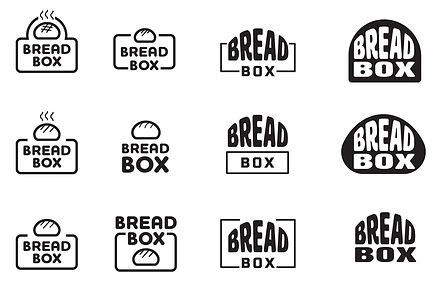
LOGO EXPLORATION
The goal of the logo was to visually express the company’s belief that the right chemistry drives stronger collaboration, better outcomes, and meaningful results. Exploration of connection and synergy, symbolizing how thoughtful partnerships fuel success.
A subtle feminine touch was woven into these concepts, reflecting the company’s identity as a women-owned firm while maintaining a sense of sophistication and credibility within the healthcare space.
FINAL LOGO
The selected logo is a visual representation of the Bread Box business model — artisanal bread delivered directly to your door. Delivery is central to their service, so I chose a square shaped logo to represent the iconic delivery box. The loaf shape nestled within the box represents the idea of fresh, handmade bread being carefully packaged and delivered. The design is simple yet warm, reflecting the artisanal nature of the company and its focus on quality and convenience.


TAGLINE EXPLORATION
For the love of bread.
Redefining fresh baked bread
Straight Outta the Oven
From our oven
to your doorstep
Homemade bread
hand delivered
FINAL TAGLINE

COLOR PALETTE
The color palette was inspired by two sources – various stages of the bread-making process, and from colors reminiscent to an entryway of a home.
From the bubbly starter, to golden-brown crust, the soft beiges and off-whites represent the dough before it’s baked, while warm brown and deep amber capture the rich tones of freshly baked loaves. This palette reflects the transformation involved in baking, creating a visual connection to each stage of the process.
The light blue and grey hues represent the colors often seen in the entryway of a home, and provide a nice balance and contrast to the warm colors found in bread, rounding out the color palette.


TEXTURES
For the website redesign, I chose to incorporate close-up images of bread textures throughout the various stages of baking. From the dough’s soft pillowy rise, to the golden crispy crusts that emerge from the oven, creating a sensory experience guaranteed to make your mouth water. By showcasing these textures, we not only emphasize the artisanal quality of the bread but also evoke the tactile sensation of baking, appealing to visitors sense of touch, smell, and most importantly – taste.
This visual storytelling approach reinforces the authenticity of the brand, connecting customers to the process and the passion behind every loaf.
PRODUCT IMAGERY
To create a modern, fresh look, I chose to showcase product imagery with a clean white background, placing the bread front and center. This minimalist approach allows the bread itself to be the focal point, emphasizing its quality and texture without distractions. I also incorporated images of the iconic delivery box featured at various doorsteps, highlighting the company’s signature delivery service.
By presenting the bread in this straightforward, elegant way, we elevate its visual appeal and communicate the premium, artisanal nature of the product.

THE FINAL PRODUCT
The new Bread Box website is a fresh and vibrant online experience that delightfully captures the bread making process, from sour dough starter—to front porch delivery. The website invites visitors into a world of bold, inviting visuals, creating an experience you can almost taste. The color palette is inviting and warm, with rich earthy tones reflecting the quality ingredients that go into every loaf. The site feels like an extension of Bread Box’s dedication to quality and service, making it as enjoyable as the bread itself.
